


IDEO invited me to design a dynamic brand identity system for Sazón, their Latine employee resource group.
From designing the first manufacturable mouse for Apple to advancing the practice of human-centered design, IDEO is a global company that has long been at the forefront of creating change through design. The Sazón employee resource group is a welcoming space within IDEO made for and by individuals who are part of the Latin American diaspora.
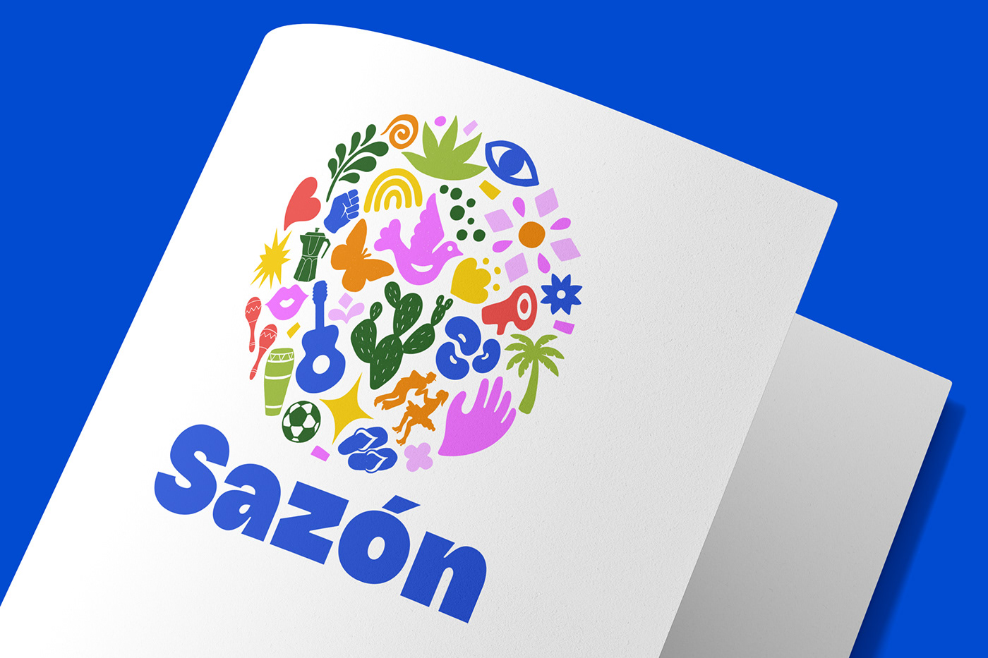


Sazón is a spice blend that is present all across Latin America. Sazón the ERG is also a blend of communities and experiences from all over the Latin American diaspora.
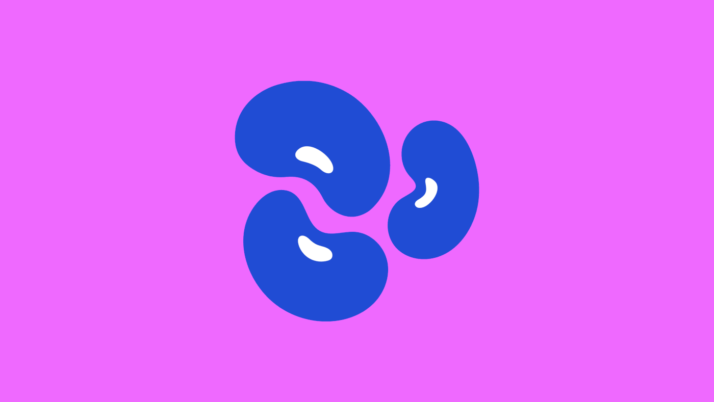
In order to represent many different facets of Latin American culture, I created a dynamic brand identity system based on Latine iconography. The logo consists of thirty hand-drawn icons intricately woven together to form a circle. Every icon represents a quintessential aspect of Latinidad. Color is key in this brand identity. The bright blue which is the brand’s main color is a direct sample out of the exterior wall of Frida Kahlo’s Casa Azul. The other colors are directly inspired by Latine textiles, fruits, cacti, and art murals found in Latine cities. Irregular, bold, and full of personality, the typographic system is a modern take on Latine-inspired fonts. With irregular edges, unexpected glyphs, and a handmade feel, every font in this system was picked to bring character even to simple layouts. To contrast the display fonts, the body font is a clean sans serif that prioritizes readability.


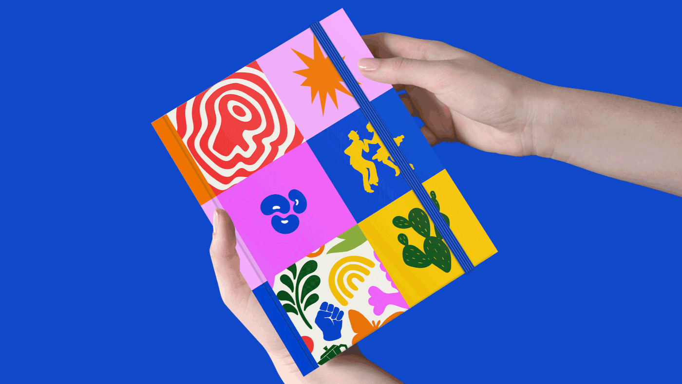


The Sazón community came together to share their favorite recipes and stories in an illustrated zine.
Recipes and stories are passed on from our elders to us, helping us keep a strong connection to our heritage. With that in mind, the Sazón community asked me to create a cookzine filled with their favorite recipes, fun activities, music recommendations, and custom illustrations.


